Creating Illustrations#
Embrace geometric aesthetics with clean lines and abstract shapes. Use our recommended color palette and shading techniques for depth. Employ shapes, strokes, and shadows judiciously to enhance the visual.
Visual Style#
Artistic Direction#
For TINKA, our creative focus is on the Geometric style. To achieve this, make use of flat elements or blend 2.5D elements in your visuals. Embrace clean lines and abstract shapes for a modern look that represents TINKA's vision. Play with geometric forms to make captivating and contemporary designs that capture the essence of TINKA.

Note: Avoid using 3D graphics. Visualise the elements with little (e.g. single-point perspective) to no perspective.
Color Palette#
Use the main Tinka colors listed below to maintain consistent and recognizable designs that reinforce the brand message. You can also use other colors like yellow or red, but only if they serve a purpose, such as:
- If a color represents a sudden visual, such as a blockage or a warning sign.
- Adding more colors to create contrast between multiple visuals in one frame.
| color name | hex code | |
|---|---|---|
| green-100 | #C3F500 | |
| green-800 | #0A5041 | |
| grey-100 | #D7E1D7 |
Click here for the full list of recommended colors
Shades#
Keep the colours monotone by using the same color but different shades. You can make it lighter or darker, depending on what you want to highlight or achieve a lightning style. For example:
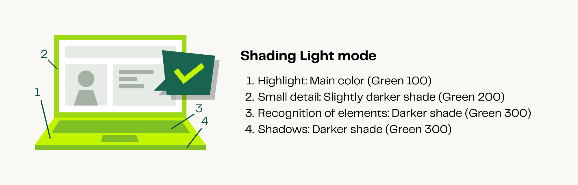
Note: If you want to add details without diverting attention from the main visual or goal, consider using gray shades similar to the laptop screen shown above.
Shapes#
Due to the flat and edgy design, we have the freedom to reshape and add elements. For instance, we can include a TINKA bubble as a background behind any illustration to prevent it from looking like it's floating.
How to use:#
The background colour should always be the lightest or a lighter colour than the illustration to maintain the main focus on the artwork and keep it clean.

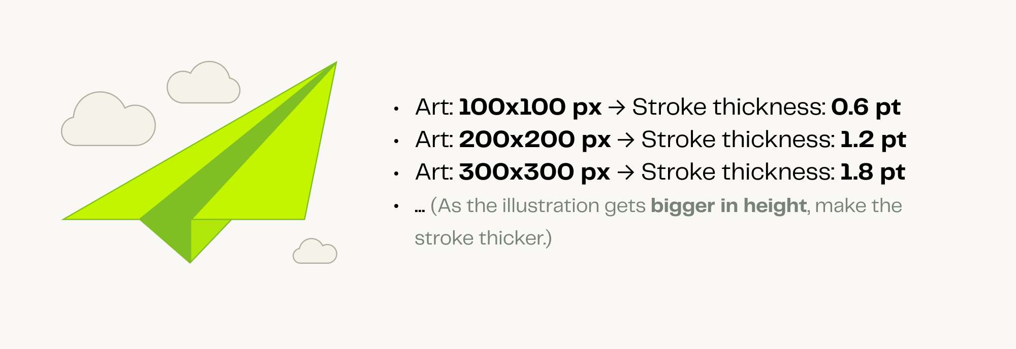
Strokes#
When incorporating strokes into designs, it is important to remember that they should generally be reserved for illustrations featuring a monotone background or multiple background colors. The strokes serve as subtle accents, preventing the color from blending too much with the background.
How to use:#
For optimal use, follow these guidelines for stroke thickness based on the illustration size:
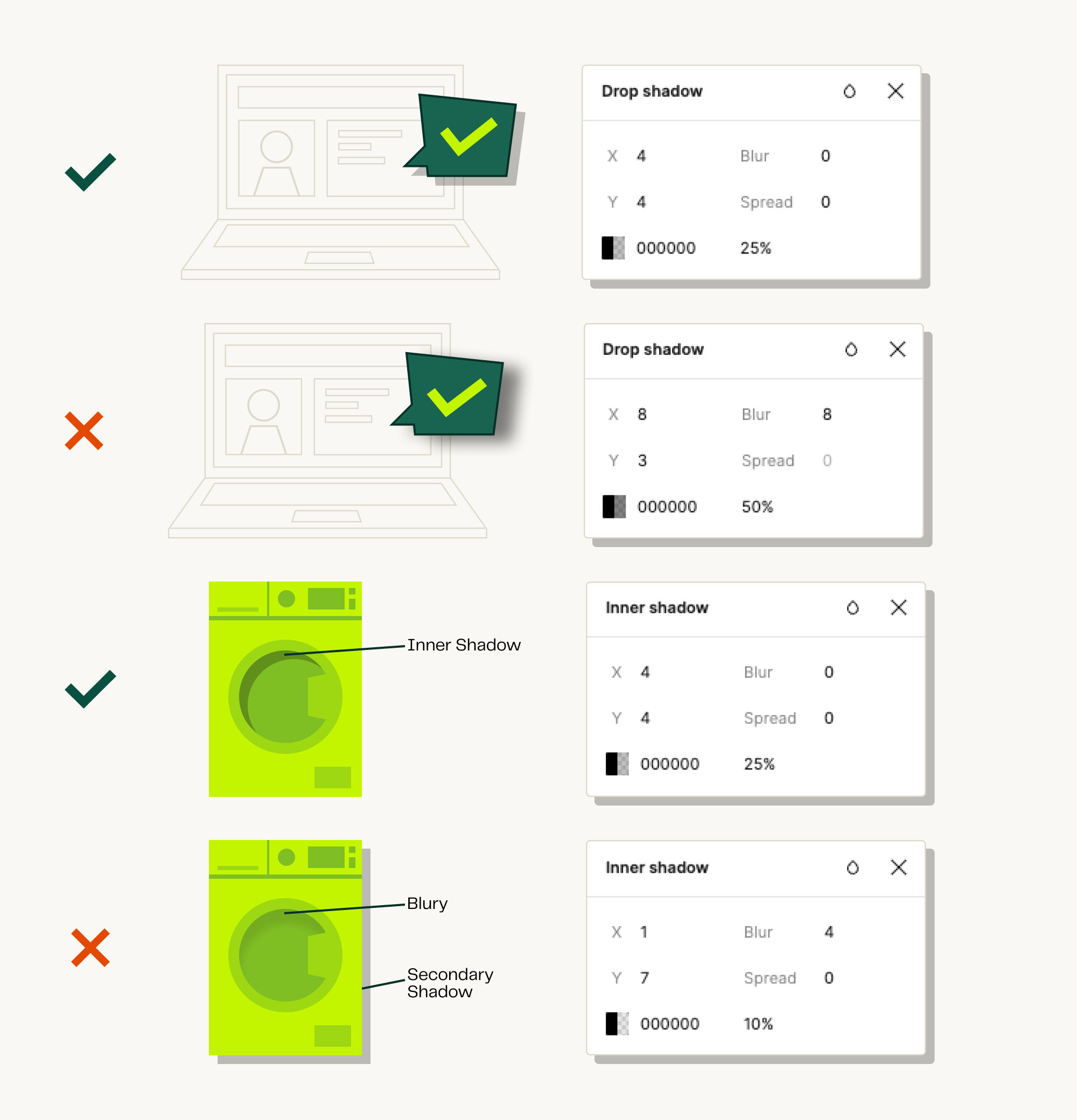
Drop Shadows#
Add a Drop Shadow whenever you have secondary illustrations overlapping or needing some extra depth for detail.
How to use:#
- Make sure your Drop Shadow settings are like the following:
- Keep the X and Y distance symmetrical
- Keep the shadow sharp (blur always on 0)
- Shadow should always be in between 15% - 25% transparent
- Shadow colour could be either black or dark green
- Use only 1 drop shadow on 1 illustration.
Take a look at the example below: